La Maison
de la Bible
A dense webshop became a storefront you want to browse.
What we were looking at.
La Maison de la Bible is a bookshop and e-commerce operation based in Paris with a national réseau — a real catalogue of books to sell, and real customers who need help finding the right one among many editions and formats.
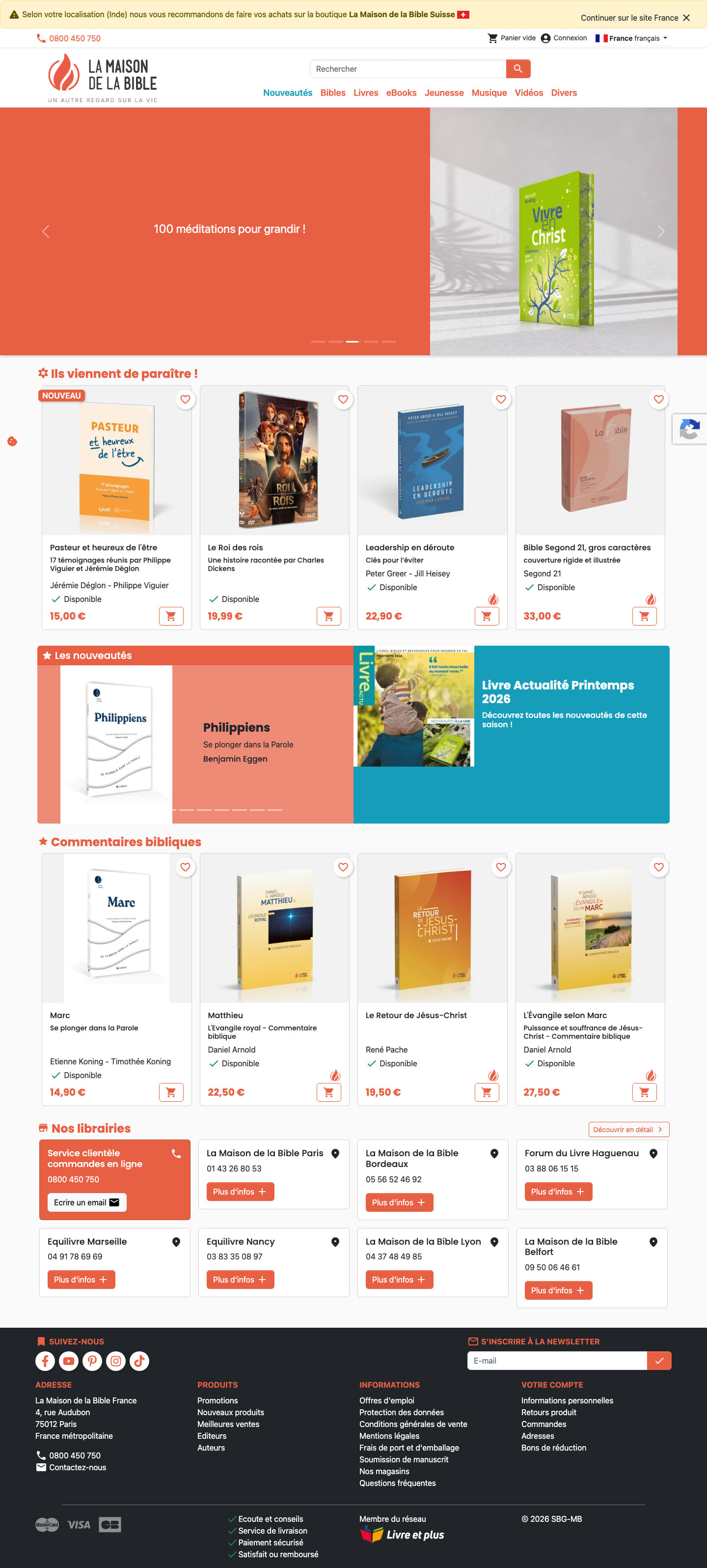
The old storefront made that harder than it should be. It was a dense, dated PrestaShop build — the familiar wall of cramped product tiles, heavy chrome, and browsing interrupted by interstitials. It was functional commerce, but it felt like inventory management rather than a shop you'd want to spend time in.
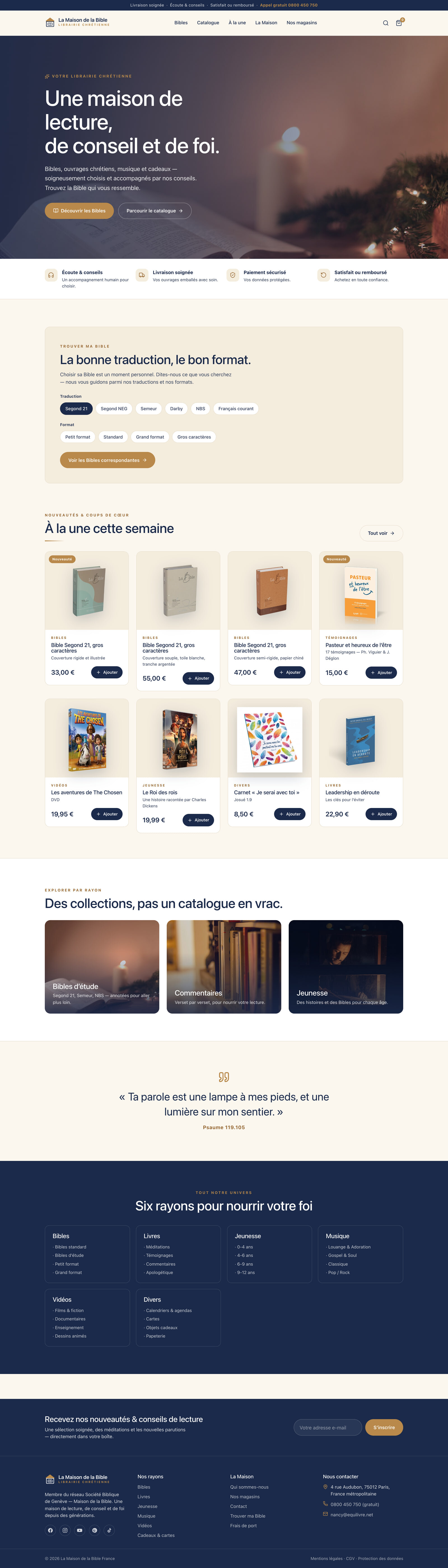
The rebuild turns it into a warm editorial storefront. Browsing comes first — clearer product cards, no interstitials in the way — and a purpose-built 'Trouver ma Bible' finder helps a customer navigate to the right edition instead of scrolling a dense catalogue and hoping.
The homepage, both ways.
Drag the line. Left is the real site as it stood; right is the rebuilt homepage, freshly captured. Same business — a different first impression.
Every page we rebuilt.
Not just the homepage. Each panel below is a full page — hover a frame to let it scroll, or open the full capture. This is where a redesign is really judged.
A shop, not a database
The homepage trades the dense PrestaShop wall for a warm, editorial storefront that invites browsing. Value-first from the start — no interstitials blocking the way — so a visitor lands in a shop they'd want to look around rather than a screen of cramped tiles.
'Trouver ma Bible'
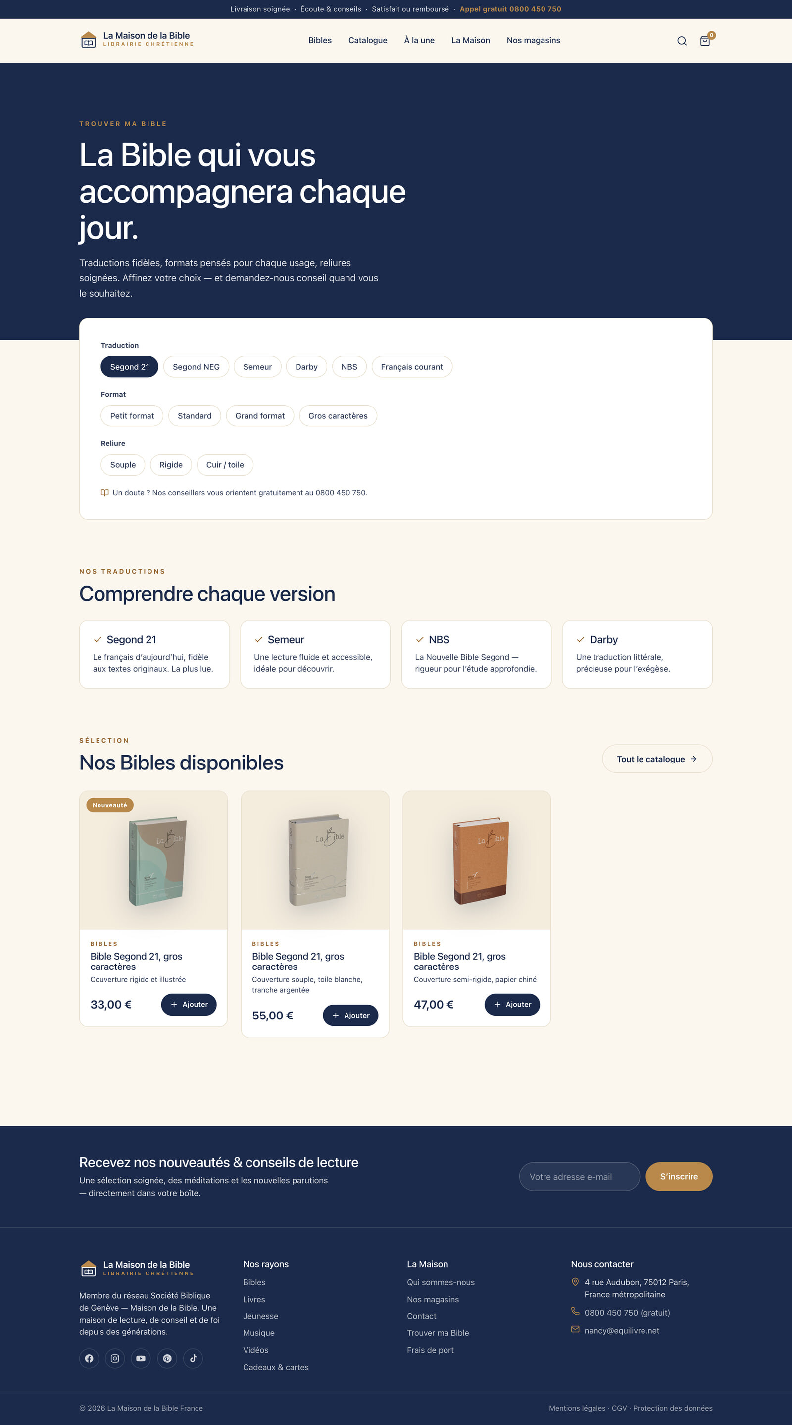
The standout addition is a purpose-built 'Trouver ma Bible' finder — a real answer to the hardest thing about this catalogue: choosing among many editions. It guides a customer to the right book instead of leaving them to scroll and guess, which is exactly where dense webshops lose people.
Cards you can actually read
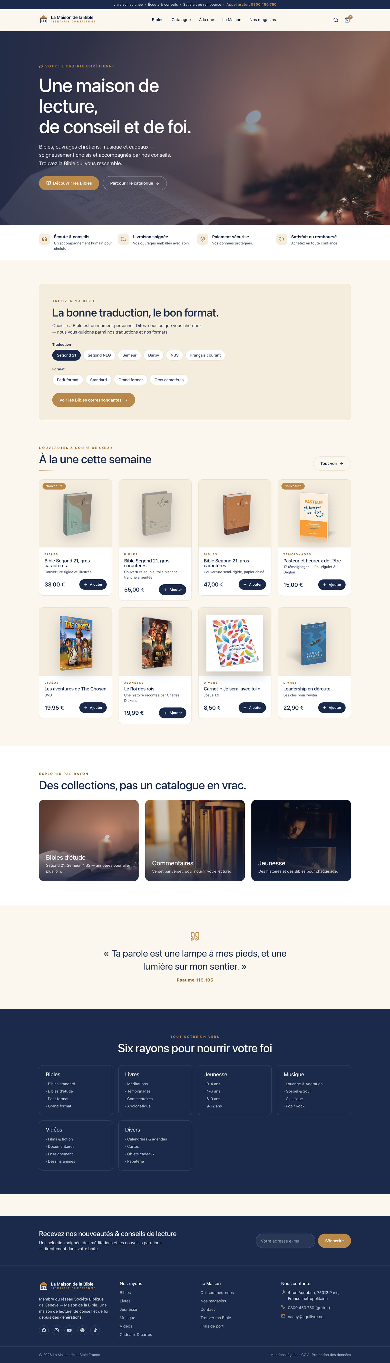
The catalogue keeps the depth but fixes the density. Clearer product cards with legible titles, prices and imagery replace the cramped grid, so browsing the full range feels like reading a shelf rather than parsing a spreadsheet.
The decisions behind it.
The whole rebuild is about the difference between inventory and a shop: make the catalogue feel browsable, and help people find the one book they came for.
Warmed up the storefront
The dense, dated PrestaShop grid gave way to an editorial storefront that reads as a bookshop rather than a database front-end.
Built a real product finder
'Trouver ma Bible' turns the catalogue's biggest friction — choosing among editions — into a guided path to the right book.
Clarified the product cards
Titles, prices and imagery were rebuilt to be legible at a glance, so browsing the range stops feeling like work.
Removed the interstitials
Value-first browsing means nothing jumps in front of the shopping — the path from arriving to finding stays clear.
Currently accepting one project
Have a site that
needs this too?
If you sell a real catalogue and the storefront feels more like inventory than a shop — dense tiles, interstitials, no help choosing — this is the rebuild that makes browsing something customers actually want to do.
Start a project ↗